Fonts and Typography
Correct, consistent, and strategic use of official typefaces reinforces the College’s identity by creating visual cohesiveness across all written communications and marketing collateral, and establishes an information hierarchy that tells the reader what is important.
A typeface refers to a set of fonts or a “font family” made up of alternate styles or treatments (italic, bold, etc.) of the same typeface. Some fonts may work better for web applications, while others are best suited for print materials.
Each of these typefaces are web-safe and open-source, chosen for their availability and readability on the internet, screens, and in print; therefore, only these specific typefaces should be used. To create a cohesive, professional aesthetic, each typeface should be used only for its intended purpose, following the guidelines stipulated below. Using two fonts of the same Typeface yields a unified look because they are designed to work together. Simplicity and contrast are key when it comes to strategic use of these typefaces: no more than three fonts (plus the logo) should ever be used on one design or communication. Occasional substitutions may be used in unofficial applications such as email, letterhead copy, documents, PowerPoint presentations, etc. when the brand typefaces are unavailable. Appropriate substitutions are noted below.
Print Fonts vs Web Fonts
Each brand typeface is open-source and can legally be used for both web and print. In addition, each brand typeface is web-safe, which means they are optimized for use on the web – but because they are carefully chosen – they work well for print when the guidelines presented here are followed.
Primary Typeface: Red Hat Display
Primary Typeface refers to the font styles intended for Display Text and Body Copy. Official documents and marketing collateral will use these fonts widely, with Accent Typefaces taking a secondary role. The “regular” font of each typeface is appropriate most of the time, with tht alternate fonts styles being used purposefully when appropriate. In some cases, alternate font styles may also work well in place of an Accent Typeface.
Typography plays a crucial role in conveying our brand’s personality and ensuring readability across all media. Our primary typeface is Red Hat Display, chosen for its modern, versatile, and clean aesthetic. These guidelines will help maintain consistency in the use of typography across all our brand communications.
Font Weights and Styles
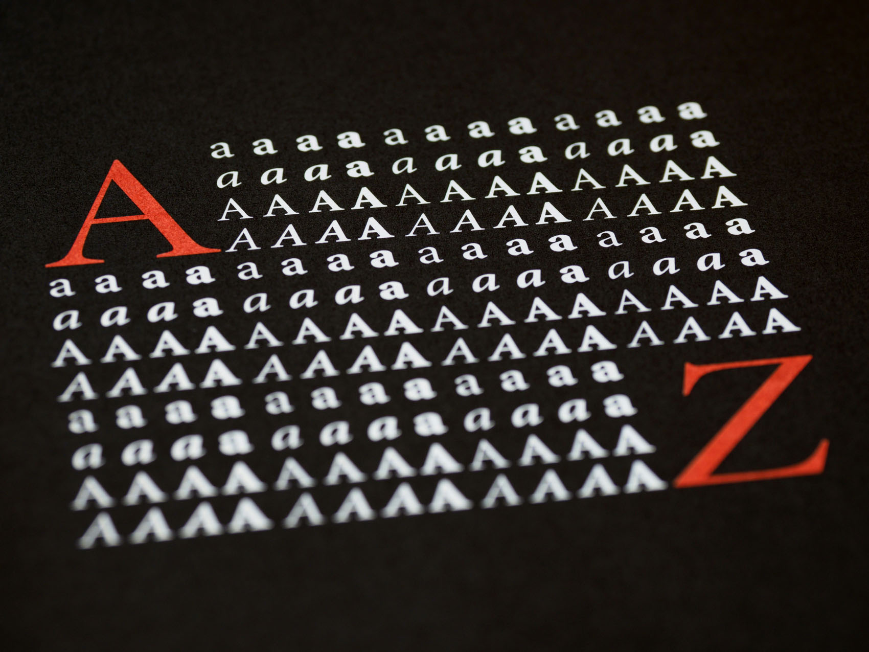
The following sections display the alphabet in both uppercase and lowercase for each weight of the Red Hat Display font family. This helps ensure consistent usage of our brand typeface across all communications. Red Hat Display comes in several weights and styles. Here are the ones we use most frequently:
- Light (300)
- Regular (400)
- Medium (500)
- Bold (700)
- Black (900)
| A | B | C | D | E | F | G | H | I | J | K | L | M |
|---|---|---|---|---|---|---|---|---|---|---|---|---|
| a | b | c | d | e | f | g | h | i | j | k | l | m |
| N | O | P | Q | R | S | T | U | V | W | X | Y | Z |
|---|---|---|---|---|---|---|---|---|---|---|---|---|
| n | o | p | q | r | s | t | u | v | w | x | y | z |
Usage Guidelines
Hierarchy and Scale
Establishing a clear typographic hierarchy ensures that our content is easy to navigate and understand. Use different weights and sizes to create a visual hierarchy.
- Headlines: Use Bold or Black, typically at sizes 32px and above.
- Subheadings: Use Medium or Bold, typically between 24px and 32px.
- Body Text: Use Regular or Light, typically between 14px and 18px.
- Captions and Labels: Use Light or Regular, typically between 12px and 14px.
Line Height and Spacing
Appropriate line height and spacing improve readability and visual appeal.
- Headlines: Line height should be 1.2 times the font size.
- Body Text: Line height should be 1.5 times the font size.
- Paragraph Spacing: Ensure there is sufficient spacing (typically 1.5 times the line height) between paragraphs.
Color Usage
Ensure sufficient contrast between text and background to maintain readability.
- Primary Text Color: Use our brand’s primary color, black or white depending on the background color.
- Secondary Text Color: Use the same or slightly lighter shade for less emphasized text.
- Background Color: Typically white, light gray or light tan for maximum contrast.
Best Practices
- Consistency: Use Red Hat Display consistently across all platforms and media.
- Readability: Always prioritize readability over style. Avoid overly complex or ornate designs that could hinder comprehension.
- Hierarchy: Use different font weights and sizes to establish a clear typographic hierarchy, guiding the reader’s attention through headings, subheadings, and body text.
- Accessibility: Ensure that text is accessible to all users by maintaining sufficient contrast and using appropriate sizes.
How to Access the Red Hat Display Font from Google Fonts
- Visit Google Fonts Website:
- Open your web browser and go to the Google Fonts website: Google Fonts.
- Search for Red Hat Display:
- In the search bar at the top of the page, type “Red Hat Display” and press Enter.
- You will see the Red Hat Display font appear in the search results.
- Select the Font:
- Click on the Red Hat Display font to open its detail page. Here, you can see various styles and weights available for this font family.
- Choose Styles:
- On the detail page, you can select specific styles and weights you need. Click the checkboxes next to the styles you want to download (e.g., Light 300, Regular 400, Medium 500, Bold 700, Black 900).
- If you want all styles, you can select all checkboxes.
- Review Selected Fonts:
- After selecting the styles, a panel titled “Selected family” will appear at the bottom of the screen. Click on this panel to review your selected fonts.
- Download the Font:
- In the “Selected family” panel, you will see a “Download all” button. Click on this button to download the selected fonts.
- A ZIP file containing the font files will be downloaded to your computer.
- Extract the ZIP File:
- Locate the downloaded ZIP file (usually in your Downloads folder) and extract its contents. You can do this by right-clicking the ZIP file and selecting “Extract All…” (Windows) or by double-clicking the ZIP file (macOS).
- Install the Font:
- Windows:
- Open the extracted folder.
- Select all the font files (with extensions .ttf or .otf).
- Right-click on the selected files and choose “Install” from the context menu.
- macOS:
- Open the extracted folder.
- Select all the font files.
- Double-click each font file, and a preview window will open. Click the “Install Font” button in each preview window.
- Windows: